Ralez
Services
Graphic Design
Client
Personal
Location
Brazil
Year
2026
Info
This project started many years ago with the goal of creating a strong brand that represented me, and beyond that, creating an identity so that all my creative projects would have a visual unification.
After extensive research, ideas and daydreams, I began sketching possible logos and pulling ideas from my mind onto paper, giving rise to the first drafts and more concrete ideas about the identity.


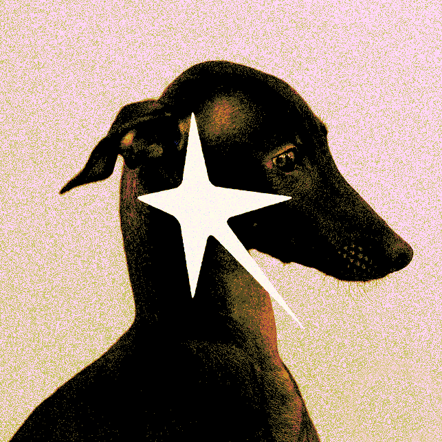
I wanted the logo to be something striking, but that also represented me, and above all contained my initial "R", both from my personal name and my pseudonym. Throughout this process I came to understand that the star archetype could represent many of my characteristics, such as movement, plurality and expansion. Together with the symbol of the Greyhound (dog), which represents speed, agility and discipline.


For the fonts, I used Archivo Black as the title font with the idea of bringing more impact alongside the logo. For body text in general, Chivo, and Roboto Mono as a supporting font, both chosen to balance the visual weight of Archivo Black and maintain clarity across different contexts.
The color palette follows a neutral approach, aligning with the overall identity and reinforcing its simplicity. This choice enhances readability while allowing greater flexibility and consistency when applied across textures and visual compositions.

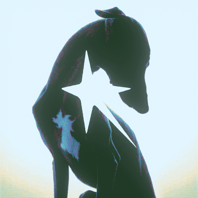
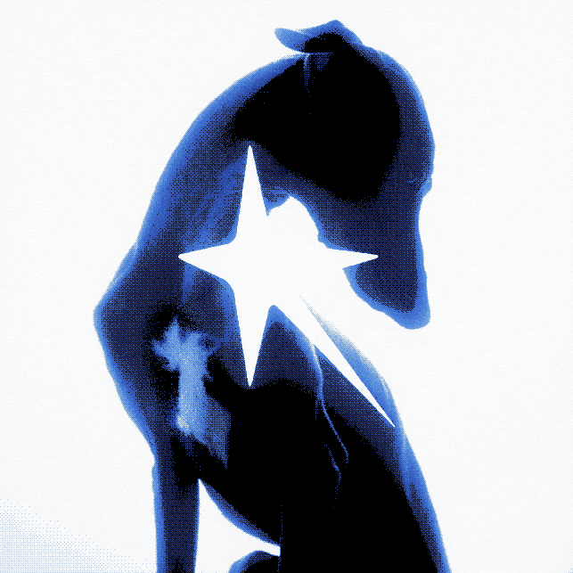
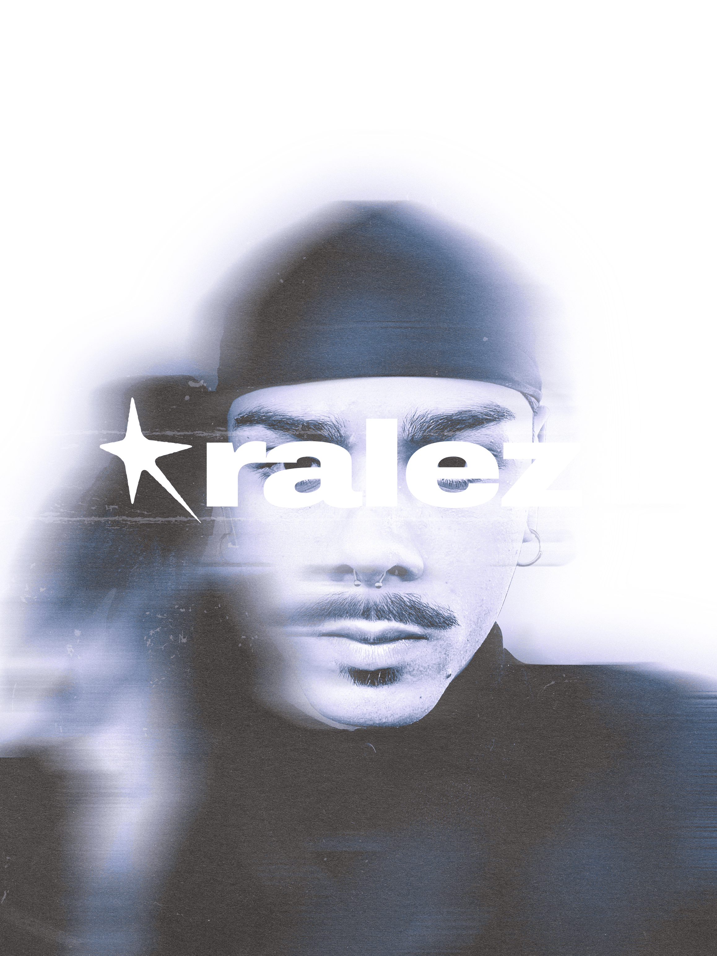

And finally, some applications bringing an aesthetic entirely focused on texture, with overlapping elements.


